
AN URBAN HEAT ISLAND: WASHINGTON, D.C., PART II
COPYRIGHT © 2009 Paul R. Baumann
INTRODUCTION:
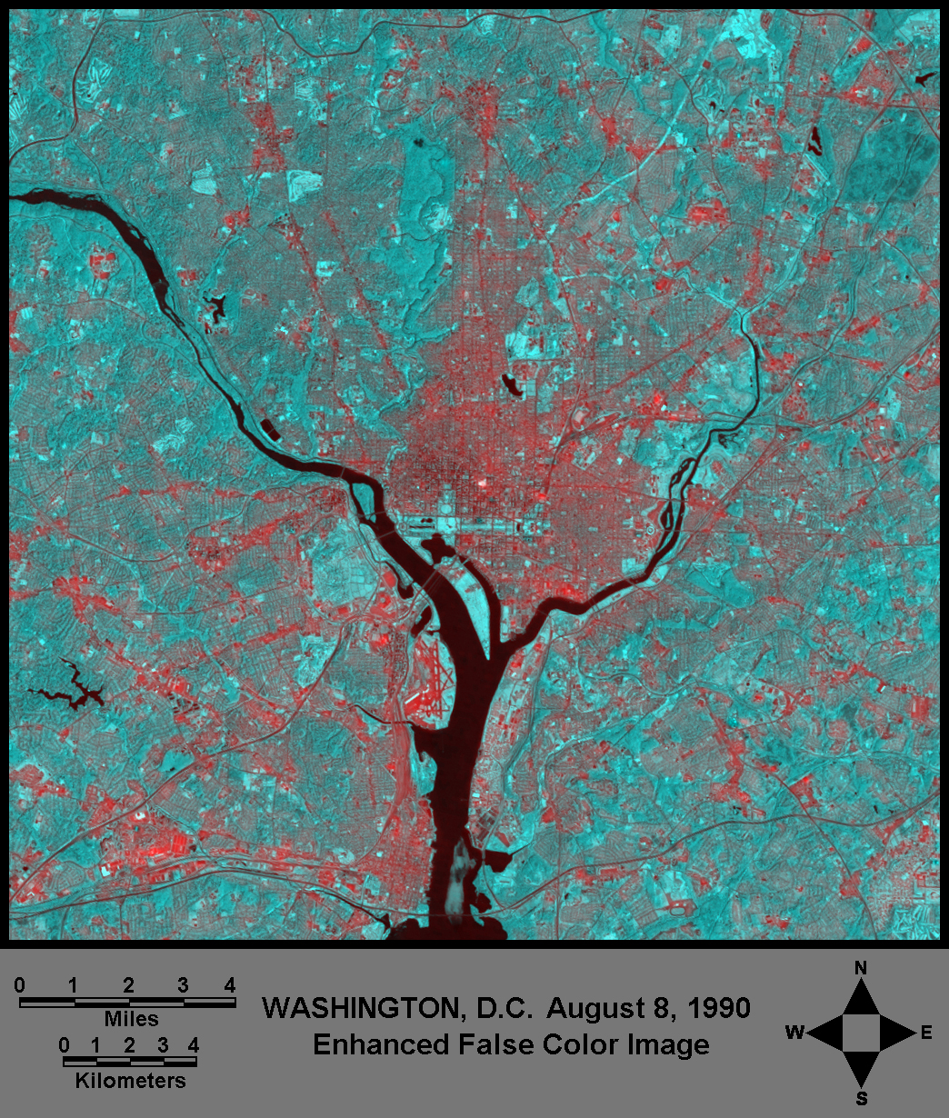
This module is Part II of the Urban Heat Island lesson. In Part I a false color composite image of Washington, D.C. was created by using Band 6 (Thermal Infrared) and Band 4 (Near Infrared) from a Landsat Thematic Mapper data set recorded on August 8, 1990. Both Band 6 and Band 4 were enhanced through the stretching of the data range. Figure 1 is the false color composite image. The various levels of red on the image represent areas with warm to hot temperature conditions and the levels of blue are cooler areas.
In Part II of the lesson, the data values associated with Band 6 will be converted into Fahrenheit temperatures and a map showing Fahrenheit temperatures throughout Washington, D.C. will be created. Also, census data, aerial photography and topographic maps in conjunction with the Fahrenheit temperature data will be used to analyze two residential neighborhoods and a park within the city pertaining to their demographic and land cover conditions and how these conditions might influence the development of the various heat levels.
CLASSIFIED TEMPERATURE MAP
NASA (National Aeronautic and Space Administration) developed a simple model for converting Band 6 data values into Kelvin, Celsius, and Fahrenheit temperatures. The model is based on the original data values, not the enhanced stretched data. The first step is to determine Band 6’s minimum and maximum data values in the image. Using EarthScenes click on “Create the histogram of a layer” under the “Enhance” menu and select Band 6. This operation will provide the minimum and maximum values for the layer. At this point a spreadsheet such as Excel is required. Enter into the first column of the spreadsheet all of the possible data values starting with the minimum value up to the maximum value. See Table 1. Note that Landsat values are whole numbers. The minimum and maximum values are 120 and 161, respectively, for the Washington, D.C. data set. Next, follow the mathematical steps outlined below placing the results of each step in a different column of the spreadsheet. ‘DN’ stands for digital number(Band 6 data values), and ‘ln’ for natural log.
|
Spectral Radiance = [0.1238 + (0.005632 x DN)]
Kelvin (oK) = 1260.56 / {ln[(60.776/Spectral Radiance)+1]} Celsius (oC) = oK - 273.15 Fahrenheit (oF) = (oC x 1.8) + 32 |
For Landsat 7 data, the formula is [0.0370588 + (3.2 x DN)].
Once the temperature values are generated for each of the digital numbers or values, certain temperature levels are identified as class levels for the map. For example, as shown in Table 1, the Fahrenheit temperature of 65.171 is the nearest value to the class level of 65oF. Thus, it will be used to identify pixels that have temperatures at 65oF and below. In order to do the actual classification the appropriate digital numbers need to be selected. They are highlighted in Table 1. In the case of the Fahrenheit temperature of 65.171 the digital number is 123.

The density slice classification technique uses a band’s histogram to divide the data into different class levels or categories. Figure 2 shows Band 6’s histogram sliced into levels. The colors represent the different classes. Once the histogram is sliced into classes, EarthScenes generates a classification map (Figure 3) and produces a table containing a pixel count for each class. See Table 2. The standard color scheme provided in EarthScenes for classified images produces a map that is rather psychedelic in appearance. Thus, use the Look-up-tables function in EarthScenes to develop a better-looking color scheme. The legend shown on Figure 3 was created outside of EarthScenes using Microsoft Paint.
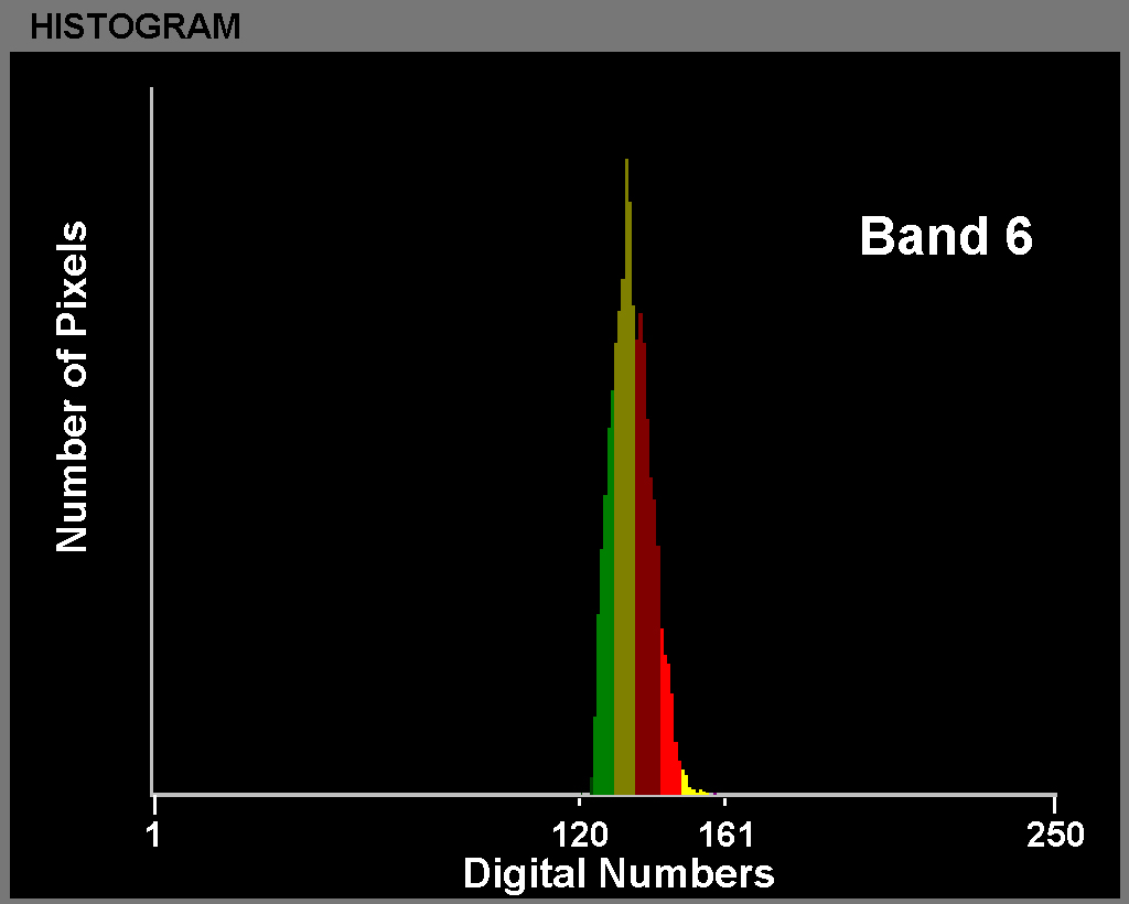
FIGURE 2: Density Slice Histogram
This classified map represents a rather detailed product considering that most urban areas possess a very small number of official U.S. Weather Bureau stations and no such comprehensive map could be created from these stations. In addition, the requirements for locating a U.S. Weather Bureau station creates a bias toward cooler environments. A station must be placed on grass surfaces a distance away from any building or paved surface.
It is remarkable to see on the map such temperature variations within a relatively small area. With EarthScenes it is possible to obtain the overall mean value for Band 6. This mean value can be converted into a mean temperature value using the same mathematical steps used to create Table 1. Again, click on “Create the histogram of a layer” under the “Enhance” menu and select Band 6. This procedure will provide the mean, which, in this case, is 134.6. When this value is converted the mean temperature is 74.55oF. When compared to Figure 3 and Table 2, nearly 41 percent of the pixels have temperatures above the mean. Between 9:30 and 10:00 AM when the satellite crossed over the city, a significant amount of the landscape had temperatures ranging from 75oF to 95oF.
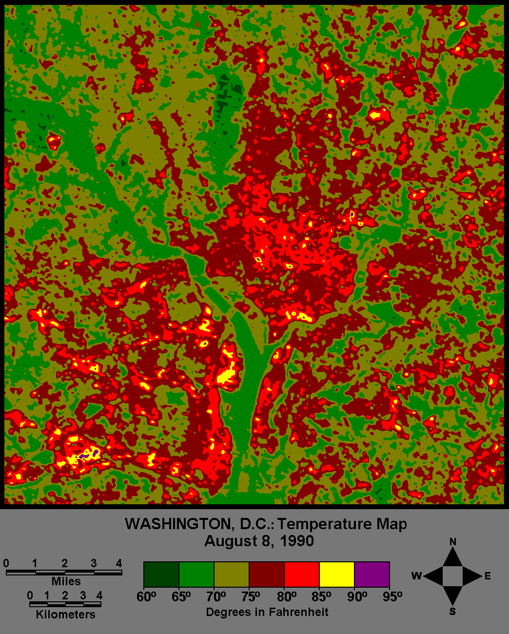
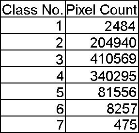
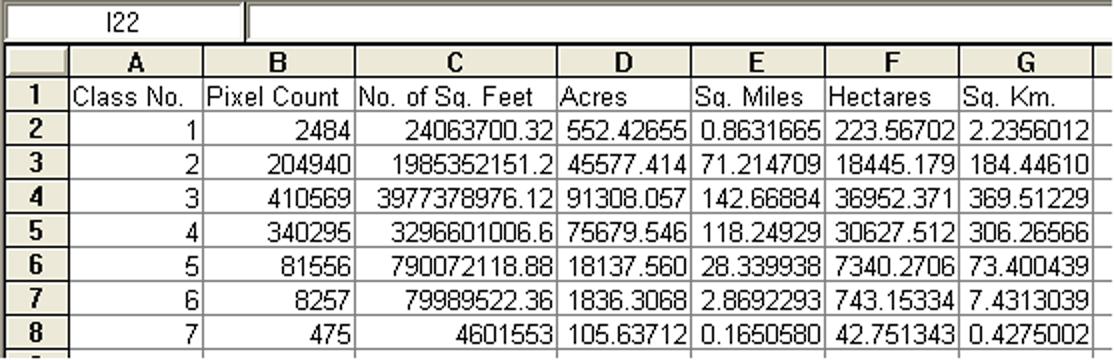
The table generated by EarthScenes can be exported into the spreadsheet program. The number of pixels per class can be multiplied by 9687.48, the number of square feet in one 30m x 30m pixel. This calculation will produce the total number of square feet in each temperature class, which is then divided by 43,560, the number of square feet per acre, to provide the number of acres in each class. Finally, the number of acres can be divided by 640 to give the number of square miles in each class. Acres and square miles can be converted into hectares and square kilometers, respectively. See Table 3 for results.
LOCAL AREAS:
Two Bethesda Neighborhoods
The next step is to analyze some local areas of the city to ascertain information about land cover conditions that might impact temperatures. The first areas to be examined are two suburban residential neighborhoods in Bethesda, Maryland. These neighborhoods were looked at in Part I. Below is Figure 18 (now renumbered to Figure 4) from Part I. Figure 4 shows three residential areas with varying densities of houses and tree cover. In this lesson only the Low and High Tree Density Areas will be analyzed.
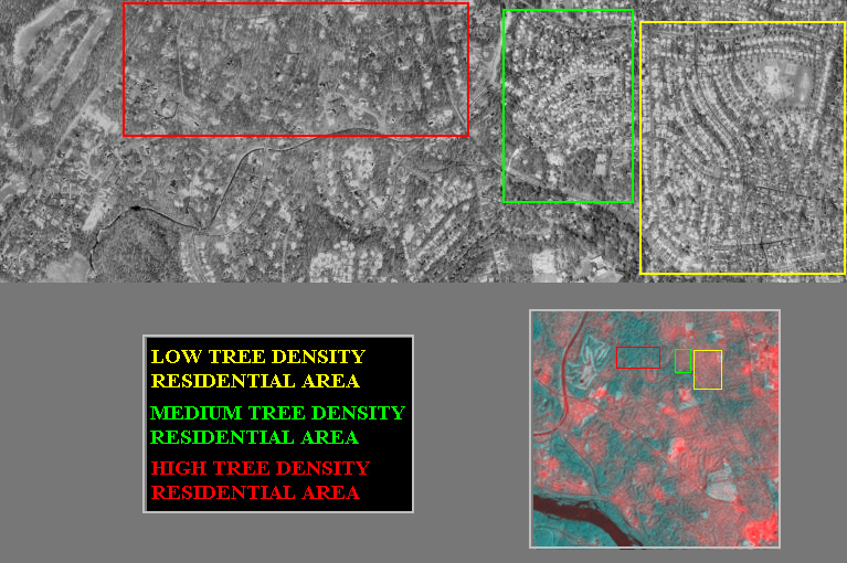
FIGURE 4: Three Neighborhoods With Different Tree Coverage
Tree coverage plays an important role in the evapotranspiration process of cooling an environment. Evaporation accounts for the movement of water to the air from sources such as soil, canopy interception, and waterbodies. Transpiration deals with the movement of water within a plant and the loss of water as vapor into the air. The greater the tree coverage the greater the level of evapotranspiration is likely to occur. Evapotranspiration helps cool an area by providing more moisture in the air. The temperature patterns from the satellite image, Figure 4, and the classification map, Figure 3, support this situation. The High Tree Density (HTD) neighborhood appears to be cooler than the Low Tree Density (LTD) area. Thus, why does one neighborhood have more trees than the other neighborhood?
Census data, aerial photographs, and topographic maps will be used to study these neighborhoods. For the 1910 census the U.S. Bureau of the Census developed within eight cities small enumeration areas called census tracts. By the 1930 census the number of cities with tracts increased significantly. Census tracts are small, relatively permanent statistical subdivisions that usually have between 2,500 and 8,000 persons and, when first delineated, are designed to be homogeneous with respect to population characteristics, economic status, and living conditions. Today all metropolitan areas and many highly populated counties have census tracts for which very large amounts of population and housing data are collected. Census tracts are generally subdivided into 2 to 4 block groups and each block group has data for the individual city blocks within the group.
Census tract data are going to be used to study the two residential neighborhoods. For the 1990 and 2000 censuses the data have been placed online at the American FactFinder web site.
http:/www.factfinder.census.gov/
However, before obtaining the data it is necessary to find the census tracts and block groups that relate to the two residential neighborhoods. At the above web site click on MAPS and Reference Maps and then highlight 2000 Census Tracts and Blocks. At this point select a state, which in this case is the District of Columbia, and click GO. The following map (Figure 5)will appear that shows the general outlines of the census tracts in an orange-brown color.
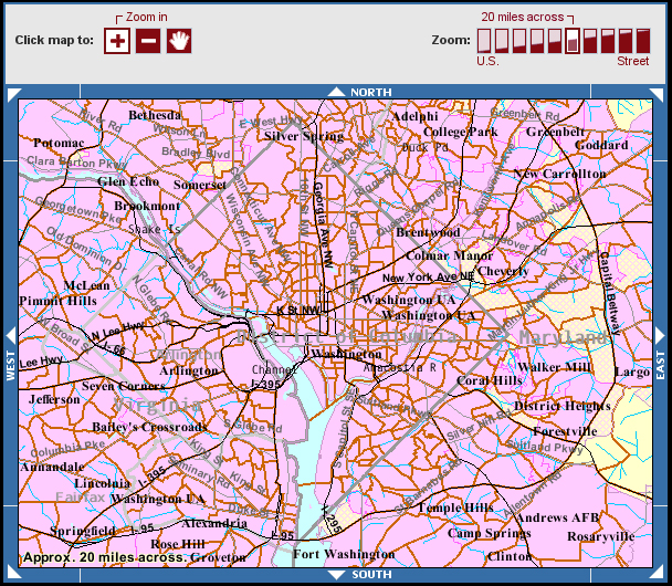
FIGURE 5: American FactFinder Location Map - Washington D.C.
Based on the satellite image in Figure 4 the two neighborhoods are situated north of the Potomac River in the northwest corner of the map. Click on this area and zoom in until it is possible to see the Census Tract numbers. It might be necessary to use other resources to find the census tracts and group numbers that cover the two areas. Some good resources can be found at the TerraServer web site maintained by Microsoft and supported by the U.S. Geological Survey. The URL for this web site is:
http://www.terraserver.com/
This site has detailed aerial photographs and topographic maps for nearly any location within the United States. At this web site an address of the desired location can be entered or the zoom function on the map can be used. Bethesda, Maryland can be used as the address. One can select the topographic map or the aerial photograph option to visualize the area. In this case two sets of aerial photographs are available, one for 2002 and the other for 1988. Click on the largest size box to get the fullest geographic coverage. It might be necessary to zoom down and navigate in different directions to find the two neighborhoods and relate them to the appropriate census tracts. Census tracts generally have irregularly shaped boundaries and are not likely to correspond directly to the rectangular areas shown on Figure 4.
The best census tract that relates to the LTD neighborhood is tract number 7046, block group 3. This area corresponds mainly to the residential development named Bradmoor. For the HTD neighborhood, the city blocks 2002, 3006 and 3007 of census tract 7059.11 provide the best fit to the rectangular area outlined on Figure 4. These city blocks form part of the development called Bradley Hills Grove. Figure 6 shows these two areas.
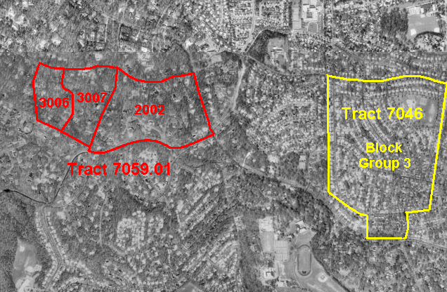
FIGURE 6: HTD and LTD Census Tracts
With the tract numbers identified, demographic information can be ascertained from American FactFinder for the two neighborhoods. Return to the American FactFinder web page and click on DATA SETS. The Census 2000 data volumes should appear. Click on Detailed Tables. Select “Block” as the geographic type under the dropdown identified as “Nation.” There will be several dropdowns, each dealing with a smaller geographic area (Figure 7). The desired census tracts, block groups, and blocks are located in Montgomery County, Maryland. Once the blocks have been identified the desired data can be selected. A table will be created. For Census Tract 7046 the geographic type will be “Block Group” rather than “Block.”
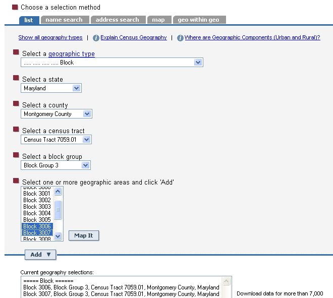
FIGURE 7: Sample American FactFinder Geographic Type Menu
Table 4 provides some population and housing data about the two neighborhoods, which were obtained from American Factfinder. In addition, the table has the approximate geographic sizes of the two areas. This information was ascertained by measurements taken from the topographic maps available from TerraServer. The LTD and HTD neighborhoods cover about 133 and 93 acres, respectively. With this information population and housing density levels were calculated.
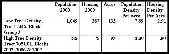
Table 4 clearly shows that the LTD neighborhood has a higher residential population density per acre than the HTD neighborhood. The LTD neighborhood also has about 3 houses per acre; whereas, the HTD neighborhood has less than one house per acre. The lower housing density allows for the development of a greater density of trees, which, in turn, permits more evapotranspiration to occur, making the area cooler than the neighborhood with less open land for tree development.
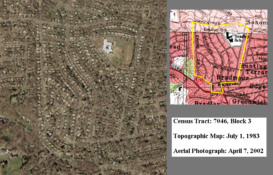
FIGURE 8: Low Tree Density Neighborhood
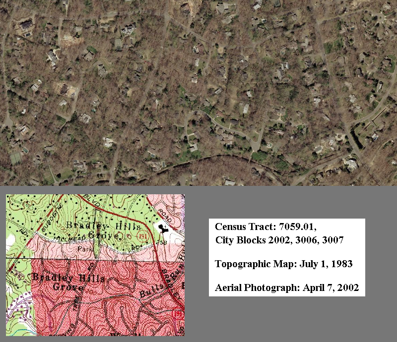
FIGURE 9: High Tree Density Neighborhood
Figures 8 and 9 show color aerial photographs and topographic maps of the two neighborhoods. The aerial photography supports the data provided in Table 4. Houses in the LTD neighborhood are packed close together. Trees are generally located in the back of the houses. Few trees are found along the streets and sidewalks where they might be more helpful with respect to cooling the concrete and asphalt surfaces. If the houses had been built slightly farther back from the streets, more space would have been available for trees. The neighborhood has a school with a large grass area. This school covers several acres; thus, the housing and population densities are higher than shown in Table 4. In comparison, large sections of tree coverage exist throughout the HTD neighborhood. The distances between houses are much greater than found in the LTD neighborhood. The contour lines on the Figure 9 topographic map indicate a rolling landscape that might not provide an adequate amount of flat land to build a high number of houses. The sizes of the houses suggest an affluent neighborhood that might have families with the financial resources to afford more space between houses, and thereby, space for more tree coverage. The Figure 8 topographic map denotes gentle sloping conditions, more suited for high density housing.
Rock Creek Park
The second local area to be examined is Rock Creek Park. It is a large urban natural area that is situated slightly to the north of the White House. The park is administered by the National Park Service, which makes it rather unique with respect to most municipal parks. The main portion of the park contains 1,754 acres along the Rock Creek Valley, making it more than twice the size of Central Park in New York City. It was established in 1890 by an act of Congress, the same year that Yosemite National Park was created. Thus, it is one of the nation’s oldest national parks. Unlike many municipally operated parks this park does not have numerous athletic fields with grass cover. The park is covered predominantly by mature trees as illustrated in Figures 10A and 10B.
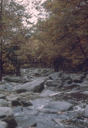
FIGURES 10A-B: Ground photographs of the park. Courtesy of the National Park Services.
EarthScenes allows one to read individual pixel values. This is accomplished by using the “Pixel Readout” function under the “Display” menu. Click on grey level images and select the original Band 6. By moving the cursor across the image the columns and rows of the cursor are displayed above the image as well as the z values. The z values provide the basic information to develop the cross-sections. The cross-sections were started in adjacent areas to the park and z value readings were taken at five pixel intervals. The readings were compared to the temperature conversion table (Table 1) to obtain the appropriate Fahrenheit temperatures. Next, bar graphs were produced from the temperature readings. Figures 11 and 12 are examples of the cross-sections.
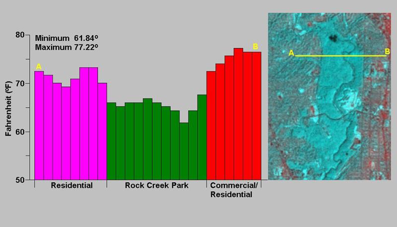
FIGURE 11: Cross-section of Temperature Readings at North End of Park
The cross-sections show a noticeable drop in temperatures between the forested park and surrounding commercial and residential land cover. The temperature difference between the park and commercial areas varied around 10 degrees Fahrenheit. The temperature range was slightly less with residential areas that had some tree coverage. The Figure 12 cross-section cuts through a portion of the park that has both forest and grass cover. The grass cover is associated with a golf course. The temperatures across the golf course were similar to those associated with the residential and commercial areas. The temperatures over the forest area were distinctly lower than over the golf course. This cross-section illustrates that many municipal parks with athletic fields are not significantly changing heat conditions within the city. A city might have a large amount of park land but if the land is not covered by a mature forest, little is being done to reduce temperatures within the city.
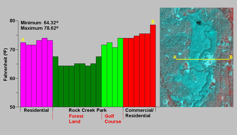
FIGURE 12: Cross-section of Temperature Readings at Middle of Park
MEGA URBAN HEAT ISLANDS
In 1960, Jean Gottmann, a French geographer, identified the region that he referred to as Megalopolis. He indicated that a super size urban landscape was growing along the northeast coast of the United States, extending from Boston to Washington, D.C. The five core cities associated with this region were merging to form one large urban conglomeration, extending for nearly 500 miles in length. Figure 13 shows through a series of maps the growth of this region from 1900 to 2050. A population density of 1,000 people per square mile represents a very high-density condition. For comparison the population density for the entire United States in 2000 was about 75 people per square mile. In 1900 the five core cities were surrounded by rural landscapes. By 2050, the rural areas are enclosed by high-density areas.
Most urban heat island research has centered on individual cities. This research has viewed urban heat islands as being local phenomena. As Megalopolis forms could it have a regional as well as a global impact on temperature conditions? Today several megalopolises exist throughout the world. Collectively, these urban masses must be reshaping weather and climatic patterns at the global level. Research is needed to study these mega urban heat islands and remote sensing through satellite imagery provides an ideal method for conducting this research.
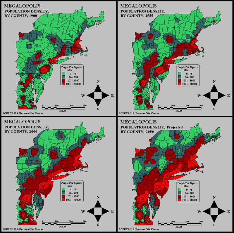
FIGURE 13: Megalopolis 1900-2050 Population Density
BOOKS:
Christopherson, R.W., 1997, Geosystems: An Introduction to Physical Geography, 3rd edition, Upper Saddle River, New Jersey: Prentice Hall, 656p.
Gottmann, J., 1961, Megalopolis: The Urbanized Northeastern Seaboard of the United States, Cambridge, Massachusetts: The M.I.T. Press, 782.
Jensen, J.R., 2000, Remote Sensing of the Environment: An Earth Resource Perspectice, Upper Saddle River, New Jersey: Prentice Hall, 656p.
Landsberg, H.E., 1981, The Urban Climate, International Geophysics Series, Vol. 28, New York: Academic Press, 275p.
Marsh, W.M. and J. Dozier, 1981, Landscape: An Introduction to Physical Geography, New York: Addison-Wesley, 637p.
WEB SITES:
URBAN HEAT ISLAND / URBAN WARMING - URBAN HEAT ISLAND / URBAN WARMING In most urban cities like Tokyo, Sendai etc., it has become more and more certain that the increase of energy consumption is causing urban heat island and air pollution. The group has clarified the mechanism of the formation of urban heat islands, and three-dimensional super computer simulations.
Heat Island Group: Learning About Urban Heat Islands - Learning About Urban Heat Islands Click here for a 5-minute overview of our research. What is an Urban Heat Island? On warm summer days, the air in urban areas can be 6-8°F hotter than its surrounding areas. Scientists call these cities "urban heat islands."
GOES-8 image of urban heat island Colorado State University Cooperative Institute for Research in the Atmosphere - Colorado State University Cooperative Institute for Research in the Atmosphere Urban Heat Island. The ability to locate urban heat islands under clear sky conditions during late night or early morning hours can be seen in enhanced 3.9 um images from GOES-8 and GOES-9.
Urban Climatology and Air Quality Studies at NASA GHCC - NASA studies the effects of urban growth on the climatology and air quality of cities.
May 27 Urban Heat Island Signatures from Aircraft - | SSL Home | Marshall Home | NASA Home | May 27, 1997: 2 a.m. Urban Heat Island Signatures from Aircraft The black and white image at right illustrates ATLAS 10m night time thermal infrared data collected over Atlanta. ATLAS thermal infrared data were acquired during the night starting at 2 am. In this night time image, urban surfaces that are "hot" or "warm" appear in varying shades of white to light gray. Notice how the roads and other asphalt and concrete surfaces are still much warmer than the vegetation. However, the warmest surfaces (white) are bodies of water. The high specific heat of water results in the water bodies cooling very slowly.
http://science.msfc.nasa.gov/newhome/essd/urban_heat/urban_heatisland_atl3.htm
American Forests Vegetation Loss and Heat Island - Atlanta - Urban Heat Islands Trees affect the weather at the local and regional scales. In parts of the world where large areas of tree cover have been removed, rainfall has decreased. Planting trees has even been used as a way to halt expanding desert areas.
http://www.americanforests.org/ufc/uea/atlanta/heatisle.html
Atlanta Urban Heat Island Research - Watson Technical Consulting 110 Deerwood Court, Rincon, GA USA 31326 Watson Technical Consulting (WTC) specializes in meteorological hazard assessments and remote sensing applications to environmental monitoring and modeling.
MESO Inc.: URBAN HEAT ISLAND - MESO, Inc. Urban Heat Island Research Forecasting Research Examples - Heat Island MESO, Inc. has performed several experiments in the Rochester and Albany, New York areas showing that mesoscale models can be used to improve electric load forecasting. The research showed that the resolution and quality of the temperature forecast can be greatly improved for an area impacted by the heat island effect by using a mesoscale model.
Click on your city to see how many more very hot days you can expect by the year 2100 as a result of global warming. You can also find your city on the list below.