AN URBAN HEAT ISLAND: WASHINGTON, D.C.
COPYRIGHT © 2001 Paul R. Baumann
INTRODUCTION:
The World's human population recently surpassed 6 billion and conservative estimates indicate that another 2.5 billion people will be added to this number within the next twenty years. With such huge numbers of people the Earth's surface is being significantly altered at an accelerated rate. Forests are being removed to provide farmland for many of these people and deserts are expanding as people denude the landscape in an attempt to find food and other life essentials. These changes to the Earth's surface have raised many questions about how humans are modifying global climatic patterns. Among the most modified surfaces on the planet are the places where humans have congregated and built their cities. Over 60 percent of the World's population now resides in cities. The large cities of the World, where the greatest degree of surface alteration has occurred, accommodate the largest portion of the World's urban population. In the United States, one out of every eight people live in one of two urban centers, the New York or Los Angeles metropolitan areas. The twenty-five largest urban areas within the United States handled 43 percent of the country's total population. Because of the size, nature, and location of urban places, many scientists have been studying the potential impact of these places on global climatic conditions. Research has shown that urban places are warmer than surrounding rural environments and this phenomenon has led to the introduction of the term, "urban heat island."
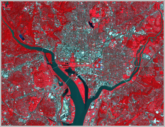
FIGURE 1
The goal of this instructional module is to develop a methodology to identify the amount of heat being emitted by various urban surfaces. This methodology employs a Landsat TM data set, which covers a study area of 1024 by 1024 pixels in size. This data set depicts summer (August 8, 1990) conditions in Washington, D.C., an urban place with over 3 million people. Figure 1 is a false color composite of the study area.
BACKGROUND:
Energy in the Atmosphere: Some Basics
When the Sun's short-wave radiation encounters the Earth and its atmosphere, approximately 31 percent of it is reflected back into space. This returned radiation is referred to as "reflection" and relates to both the visible and ultraviolet portions of the electromagnetic spectrum. The reflective nature of a surface is its "albedo." Thus, the 31 percent of the reflected solar radiation is the Earth's average albedo based on the combination of the different cloud types, the amount of atmospheric gases and dust, and the various land and water surface conditions encountered. The remaining 69 percent is absorbed by the Earth and eventually returned to space as long-wave radiation.
The nature of the Earth's surface plays a key role in how much radiation is absorbed and emitted later as long-wave radiation. This released energy is called "emittance" and can be measured in the thermal infrared portion of the electromagnetic spectrum. The two major surface conditions that the Earth possesses are water and land. In general, water is a better surface for absorbing solar energy than land. However, each of these two basic surfaces has a wide variety of conditions. With respect to land, there exist surfaces such as deserts, rainforests, and snow-covered landscapes as well as many variations within these environments. Through the processes of deforestation and desertification, humans are modifying the Earth's land surface and changing the nature of how much solar energy is being absorbed. The geographic arrangement of these activities relates to the changes in global climatic patterns.
In addition to deforestation and desertification, industrialization and urbanization are also changing the face of the Earth and how solar energy is absorbed. The processes of industrialization and urbanization change weather and climatic patterns in several different ways.
Urban surfaces are frequently made of glass, metal, asphalt, concrete, or stone. The reflection and absorption abilities of these surfaces exceed most natural surfaces resulting in higher day and night time temperatures than surrounding rural landscapes.
Also, many urban surfaces are paved making it impossible for precipitation to penetrate the soil. One-third of the typical American city is dedicated to the automobile and most of this space consists of paved streets, parking lots, and driveways. Under these conditions high water runoff exists and the few vegetated surfaces available must endure small flash floods followed by dry conditions within a short time span. This situation provides little water for evaporation, and thereby, expends little net radiation on evaporation.
In addition to horizontal surfaces, many cities have large vertical surfaces of different geometric shapes. These vertical surfaces function like canyons affecting radiation and wind patterns. Radiation is reflected back and forth off the walls of buildings resulting in entrapped energy and higher temperatures. Buildings also disrupt wind flow creating less heat loss. Cities have about 25 percent less wind velocity than rural areas even though buildings can produce local turbulence and funneling conditions.
The high consumption of fossil fuels in cities for heating and cooling of buildings and running of automobiles results in more heat being released than being received. Christopherson reports that during the summer months in New York City the use of fossil fuels creates 25 to 50 percent more outgoing energy than incoming solar energy. In the winter, this amount increases to 250 percent.
The high concentration of air particulates such as dust, pollutants, gases, and aerosols over a city creates a greenhouse condition where a heavy blanket of particulates absorbs the long-wave radiation coming from the city and reradiates it back down on the city. These blankets are called "dust domes" and every major city has such a dome. More water vapor forms around the increased particulates within these domes leading to more cloud cover over a city and the potential for increased precipitation.
Finally, as the large cities of the world increase in size, and thereby, come closer together, they begin to create massive heat domes. Megalopolis, a term introduced by Jean Gottmann in 1961, for the large, almost continuous urban expansion from Boston to Washington, D.C. represents such a situation. Throughout the world other such megalopolises have developed. How their size and location impacts global climatic patterns has yet to be determined.
The combination of the above conditions creates the "urban heat island," a human-induced climatic modification of a portion of the Earth's land surface. Table 1 provides a comparison between cities and rural areas with respect to climatic elements.
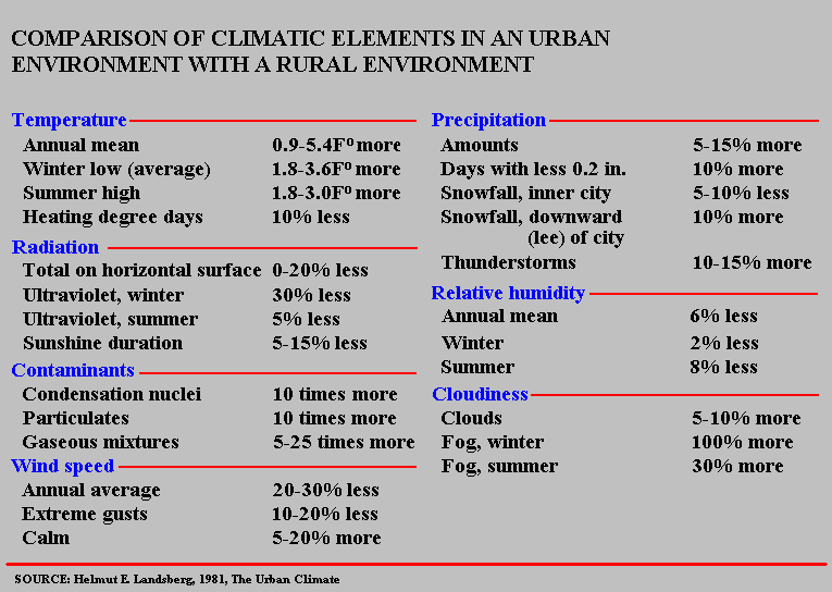
TABLE 1
Thermal Infrared Imagery
This module is based on using thermal infrared imagery. To use effectively such imagery, a good understanding of the diurnal cycle, that is the daily cycle, of the temperature of various surface materials is needed. Starting at sunrise, the Earth receives short-wave radiation from the Sun, which continues throughout the day until sunset. Much of this radiation is reflected back into the atmosphere where satellite and airborne remote sensing devices can measure it within different portions of the electromagnetic spectrum as reflected energy. However, in the case of thermal infrared energy, the short-wave radiation must be absorbed and released at a later time as long-wave radiation. In general, outgoing long-wave radiation lags two to four hours behind the incoming short-wave radiation but the nature of the surface materials plays a key role in this lag time. Figure 2 provides a generalized model of incoming and outgoing energy within a normal twenty-four hour period. The outgoing long-wave energy continues not only through the day time hours but also throughout the night, which permits thermal infrared images to be recorded both during the day and night. Note that Landsat crosses over an area at mid-morning.
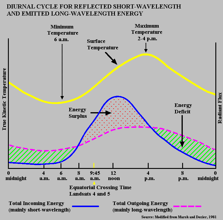
FIGURE 2
Figure 3 is also organized based on a normal twenty-four hour period but it centers on the radiant temperatures of different surface materials. Some surfaces such as water effectively store up incoming energy and release it slowly throughout the day as emitted energy. Such surfaces demonstrate little temperature fluctuation. Other surfaces such as bare soil/rock and concrete do not have high thermal storage capacities, and thus, have wide temperature variations. A thermal crossover occurs when two or more surfaces at a given time has exactly the same radiant temperature in which case the surfaces cannot be separated through thermal infrared imagery.
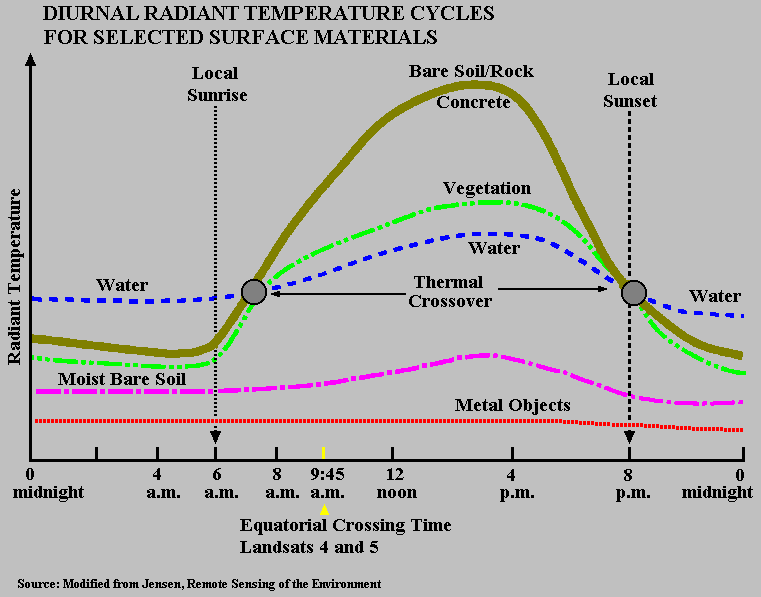
FIGURE 3
With respect to the urban landscape, studies conducted using high spatial resolution thermal infrared imagery show that during daytime hours commercial areas such as central business districts and shopping centers record the highest temperatures. Service, transportation, and industrial areas have the next highest temperatures. The lack of vegetation coverage is apparent in these areas. The coolest daytime temperatures are associated with water surfaces, vegetation, and agricultural land use. The agricultural land is covered by some type of vegetation and is not bare soil. Residential areas consisting of a mixture of buildings, grass, and tree cover record intermediate temperatures. It should be noted that some variation occurs within residential areas. For example, older high to middle income residential areas generally have a high density of mature trees, which makes them slightly cooler than newer suburban high to middle income residential areas that have large grass areas with a scattering of trees. Also, low income residential areas often have a high density of buildings with little vegetation coverage, resulting in these areas having high temperatures.
During the night, commercial, service, industrial, and transportation areas cool off rapidly; however, the predawn temperatures for these areas are still higher than those recorded for vegetation and agriculture. As would be expected, water with its high thermal storage capacity is the warmest surface during the predawn hours.
ANALYSIS:
The concept of the urban heat island is often presented in a way that one might receive the impression of a large build up of heat in the center of a city and this heat gradually decreases over the suburbs and eventually disappears in the rural environment. See Figure 4, which was acquired from a NASA web site. This impression is partially correct but cities contain many different land covers within small geographic areas, which can create noticeable variations in temperatures. Using a Landsat data set of Washington, D.C, the goal of this module is to examine the variations in temperatures, which exist throughout the city due to different land cover conditions.
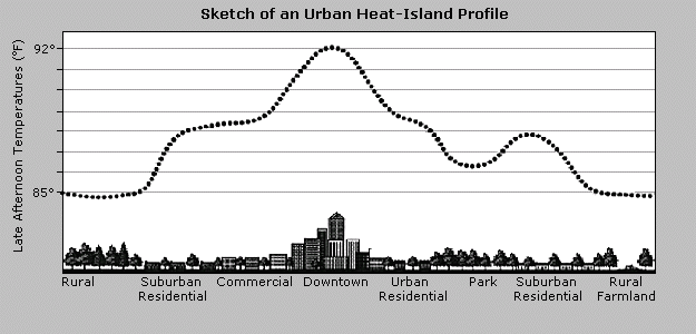
FIGURE 4
Washington D.C. was selected for this exercise for several reasons. First, it is one of the major urban cores in the Northeast Coast Megalopolis, which as previously indicated is an example of large cities merging together to form one huge urban heat island. Second, it is not a vertical city such as New York, Chicago, or San Francisco. It is horizontal in development with large, open sections of different vegetation covered areas. Even though Washington, D.C. is an old city, its horizontal and spread out nature makes it similar to many of the newer large cities within the United States. Third, it does not have the traditional central business district or the heavy industrial activities found in many old cities. Again, it is similar to the newer large cities in the United States.
Methodology
A Landsat Thematic Mapper (TM) data set has seven spectral bands, six of which measure reflective energy in different portions of the electromagnetic spectrum. The seventh band, identified as Band 6, records emitted energy in the thermal infrared portion of the spectrum. This lesson is built around using Band 6 since it is recording heat conditions. The major problem in using this band is its poor spatial resolution, which makes it very difficult to identify different land cover conditions especially in urban areas. The spatial resolution for one picture element or pixel in Band 6 is 120 meters x 120 meters. The other bands have a spatial resolution of 30 meters x 30 meters per pixel. Figure 5 illustrates this situation by comparing Band 6 to Band 4. One can easily detect street patterns, forests, stream paths, as well as other features in Band 4 but no such possibility for identifying such features exists with Band 6. Figure 5 starts at the Capital and goes eastward across the Anacostia River.
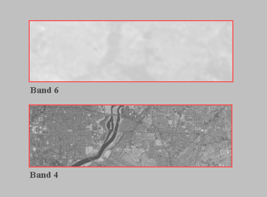
FIGURE 5
To help partially overcome this resolution problem a color composite can be created using Band 6 for one of the three basic colors in such a composite. Band 4, which has good spatial resolution, can be used for the other two colors. EarthScenes permits one to make color composites. It will ask what color should be assigned to each band. Use the red color for Band 6 and the blue and green colors for Band 4. Since the lesson is dealing with heat, it is appropriate to use red for Band 6. Figure 6 shows a portion of the color composite. One can clearly see the spatial resolution being provided by Band 4 and the heat by Band 6. However, based on the amount of red shown in this composite one might conclude that high amounts of heat exist throughout the entire city.
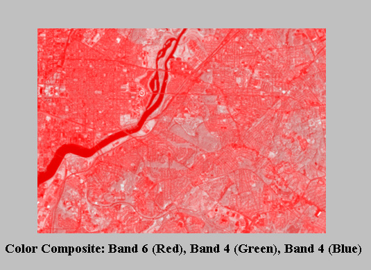
FIGURE 6
The problem with this color composite relates to the data values and ranges associated with the two bands. The potential data range for any band is 256 levels of intensity. Each pixel within a band has a value within this range. The higher the value is, the greater the intensity level. If one pixel has a very high value, it will appear as a bright point on an image, and if another pixel has a very low value, it will appear as a dark point. Most of the time the pixel values within a band will not use the total potential data range of 256 levels. This smaller range is referred to as the dynamic or actual range. EarthScenes permits one to develop histograms showing the distribution and range of data values in each band. Figures 7 and 8 show the histograms for Band 4 and Band 6, respectively. Band 4 has a much wider dynamic range than Band 6. However, all the data in Band 6 are concentrated at a high intensity level; whereas, much of Band 4's data fall within the low intensity level. It is because of this situation that the color composite displays such a high intensity of red. In assigning red to Band 6 the intensity of red for each pixel is going to be high. Band 4 with its large number of low values cannot produce comparable intensities in the colors of green and blue
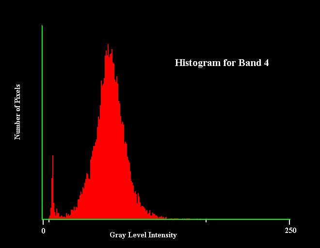
FIGURE 7
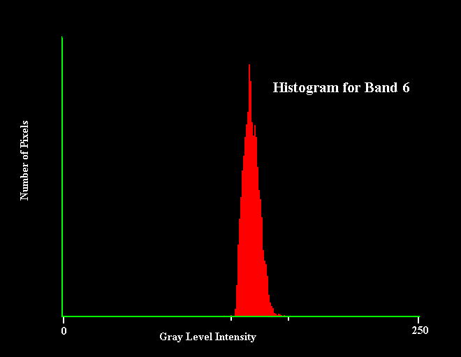
FIGURE 8
To handle this problem the dynamic data range or some portion of it can be stretched to take advantage of the full potential data range. EarthScenes allows one to stretch the dynamic data range of any band and store the results as a new layer. However, EarthScenes limits the potential data range to 250 levels of intensity, which is not a major problem. Before stretching a data set it is advisable to determine the minimum and maximum values within the set and examine the distribution of the data. The minimum and maximum values for Band 4 are 6 and 168, respectively. One can use these values to stretch the data, in which case all pixels with the value of 6 would be assign the value of 1 and all pixels with the value of 168 would be made 250. Values between 6 and 168 would be adjusted between 1 and 250. However, in reviewing the data distribution for Band 4 through the use of the histogram (Figure 7), one can see that the number of data values drop off rather quickly in the upper portion of the dynamic range. In fact, between the data value of 116 and the maximum data value of 168, there are only 5,243 pixels out of a total of 1,048,576 pixels within the image. This is only .005 of the image. Thus, rather than stretching Band 4 between 6 and 168, one would get better looking results by using 6 and 116. The same procedure can be used for Band 6 but in reviewing the distribution of its data (Figure 8) one can observe that very little data exist at both the lower and upper levels of the histogram or dynamic range. The minimum and maximum values for Band 6 are 120 and 161, respectively, but better results can be obtained by using 122 and 150. The histogram function under EarthScenes identifies the percent of the total data on either side of a particular data value. This information is helpful in determining what cutoff levels to use in stretching a data set.
Stretch both Band 4 and Band 6 using the desired values indicated above and save the new stretched bands. Figure 9 displays portions of both the original images and stretched images for Band 4 and Band 6. One can detect National Airport along the Potomac River. Using the stretched bands, create a new color composite with the stretched Band 6 being assigned the red color and stretched Band 4 the blue and green colors. The two stretched data bands now have dynamic data ranges between 1 and 250 and are balanced. Thus, Band 6 with the red color should not dominate the new color composite as it did with the first color composite. Figure 10 shows a portion of the new color composite. Compare it with Figure 6. One can see some well-defined hot spots in the new color composite but one can also observe a number of cooler areas, which are bluish-green in color.
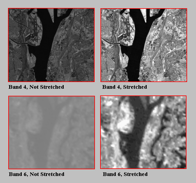
FIGURE 9
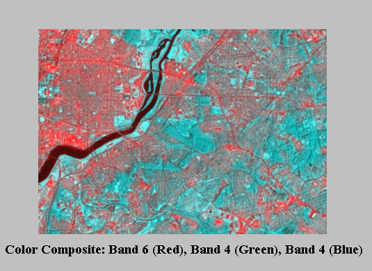
FIGURE 10
The creation of a third color composite might assist in looking at certain land cover conditions, especially areas covered by vegetation. This composite would again assign the stretched Band 6 to the red color but the non-stretched Band 4 to the blue and green colors. The logic associated with this combination is that the original Band 6's dynamic range was very concentrated; whereas, the original Band 4's dynamic range was already quite wide. Thus, with this combination, the ranges for both bands will be wide. Figure 11 shows this particular combination. The commercial and residential areas look like they have red clouds hanging over them. The vegetated areas have little or no red associated with them indicating relatively low temperatures.
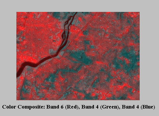
FIGURE 11
Sample Areas
Now that a certain methodology has been developed for ascertaining heating conditions within an urban environment, it is time to examine specific places within Washington, D.C. The first place to be studied is Rock Creek Park, which is located about five miles north of the White House. Established on September 27, 1890 Rock Creek Park is one of the oldest national parks in the National Park Service. With 1,754 acres it is also one of the largest forested urban parks in the United States. It is 85 percent forested with mostly mature trees that shed their leaves in the fall. Playgrounds, parking lots, roads, and mowed lawns occupy most of the remaining land. But here and there along the fringes meadows have created swaths of deep grass and wildflowers, not lawn, not forest, but areas in between, left to grow on their own. Unlike many municipal parks, which are designed to provide athletic fields and open space, this park is predominately covered by natural forest.
Figure 12 shows the three color composites centered on Rock Creek Park and surrounding areas. The park can be identified in all three composites but it is the last composite (C), which clearly delineates the park from surrounding commercial and residential areas with respect to heat build up. One can use the Pixel Read-Out function in EarthScenes and do a cross section of heat levels from one side of the park to the other side. The readings should be taken for the red color, which corresponds to the thermal infrared band, Band 6.
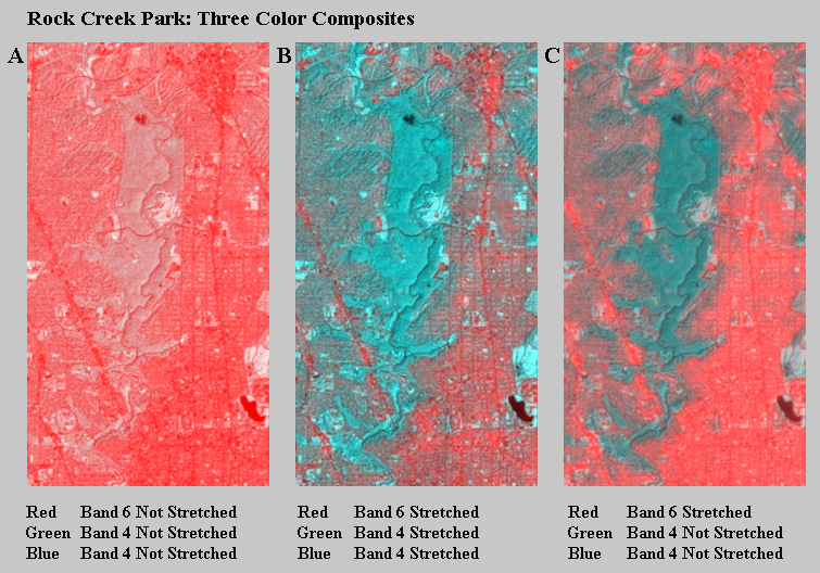
FIGURE 12
Although most of the park is forested, a golf course with grass covered fairways and greens exists on the east side. One can see a noticeable temperature level change between the forest and grass covered areas. Using the middle composite (B) and the Pixel Read-Out function, one finds that the emittance levels for the commercial/residential areas immediately next to the golf course range between 140 and 150. In fact, the club house has a level of 144. The grass areas over the golf course have levels between 100 and 110; whereas, the forest is ranging between 19 and 28. Although actual temperature values are not available, one can observe the relative differences in heat emittances between the three land covers. The difference between forest and grass covered areas is greater than the difference between grass and commercial/residential areas. Figure 13 is an aerial photograph of the golf course and neighboring areas taken in May, 1993. It provides a more detailed examination of the golf course.
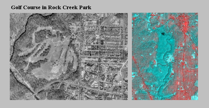
FIGURE 13
The second place to be studied is the Mall within the middle of the city. Washington, D.C. is a planned city. Pierre Charles L'Enfant who employed many features associated with the Renaissance cities of Europe designed it. His design consisted of a number of diagonal streets superimposed on a grid street pattern. The city was divided into four quadrants centering on this large park like area called the Mall. His plan had the Capital located on high ground looking down the westward extension of the Mall toward the Potomac River. The White House's location was also on high ground looking southward toward the Potomac. Major government buildings were to be built along the edge of the Mall. This is the basic arrangement of buildings today.
Figure 14 displays the three color composites centered around the Mall. Each of the composites has been expanded by a factor of 2 in order to make it easier to observe features. Large sections of the Mall are grass covered. Trees line the sidewalks and certain monuments. The middle composite (B) provides the best detail. The grass areas appear in light blue; whereas, the tree covered sections are in dark blue. In general, the various national museum buildings linked with the Smithsonian give off very little heat. These buildings line the Mall. The National Museum of Natural History, in particular, is a cool place. In contrast, the Capital, the source of many heated debates, is a hot spot. The White House remains a cooler domain. It is interesting to note the variation in emitted energy between buildings within close proximity to each other and the Mall. One can take a map of the Mall and identify the various buildings and their emittance level. Figure 15, an aerial photograph of the Mall taken on April 5, 1988, provides more spatial detail of the Mall and shows the design of the buildings around the Mall. With this information one might want to look at the architecture of the buildings and determine if any correlation exists between architecture and thermal emittance levels.
The bottom composite (C) shows some heat being emitted over the grass areas of the Mall. The contrast between the surrounding built-up areas and the Mall is not as great as the contrast found with Rock Creek Park and the neighboring built-up areas. This suggests that grass areas are not as good in holding thermal energy as forested areas. This situation was also noted with the golf course in Rock Creek Park.
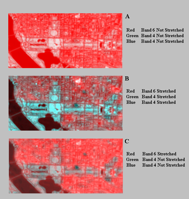
FIGURE 14
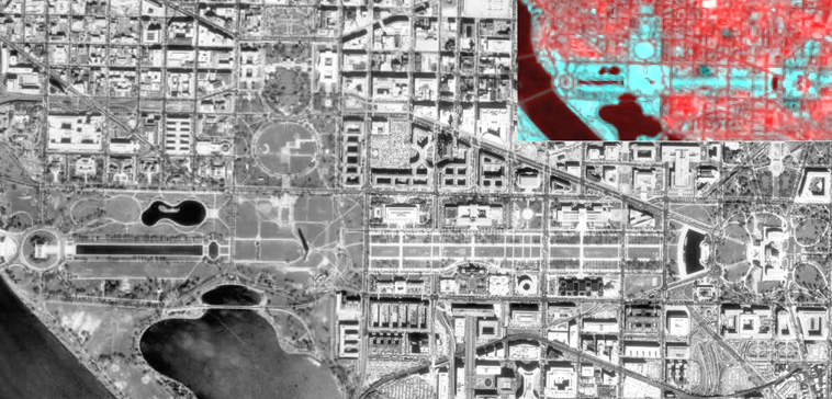
FIGURE 15
The final place to be examined is a predominately residential area located northwest of the Mall. In addition to having a mix of residential conditions, the area has golf courses, schools, and a variety of small commercial activities. Figure 16 displays the three color composites for the area. As was the case with the previous places studied, the first composite (A) provides very little information in terms of geographic variation of thermal energy. The middle composite (B) shows some variation but most residential areas appear to be basically the same. The third composite (C) illustrates variations in the thermal levels within residential areas. One must keep in mind that the numerical values for the thermal band in both the middle and the third composites are identical. It is the differences in the values for the other band, Band 4, which brings out the thermal information on the one composite.
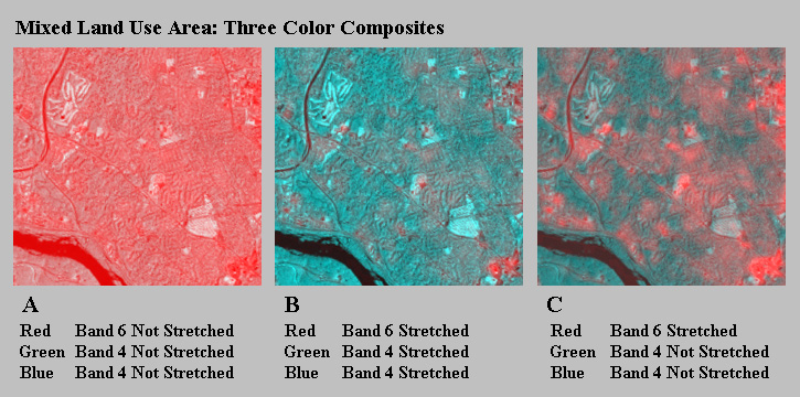
FIGURE 16
Aerial photography is used to identify the differences in the residential conditions seen on Figure 16 (C). The aerial photography provides more spatial detail and allows one to relate the differences in thermal intensity to land cover. Figure 17 shows three residential areas with various densities of trees. The one residential area has very few trees and when compared to the color composite, has a high level of thermal energy. Using the Pixel Read-Out function, the thermal levels in this residential area range from 135 to 144. In contrast, another residential area has a high density of trees and has thermal levels from 37 to 46. The third residential area with an intermediate coverage of trees has thermal levels of 90 to 108. Figure 18 shows three other residential areas within the same study area and the results from these areas are nearly identical to those found in the residential areas in Figure 17. Tree coverage plays a key role in keeping an area cool.
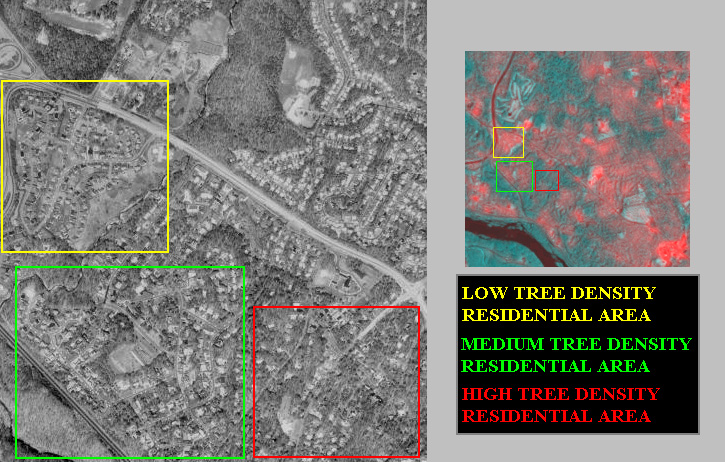
FIGURE 17
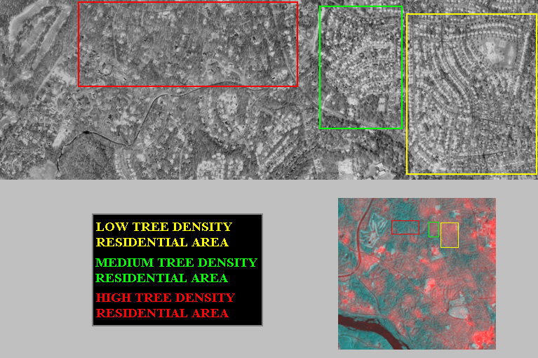
FIGURE 18
FINAL COMMENTS:
This instructional module has examined various thermal levels throughout Washington, D.C., and has shown that although an urban heat island might exist over the city, thermal levels vary considerably within the city with a direct relationship to land use and vegetation coverage. Students can study the same three places used in this module or seek out other areas within the data set. Also, other composites might be explored. Rather than using Band 4 for spatial detail and the blue and green colors in a color composite, other bands might be employed. Below are some sources mentioned throughout the module as well as some web sites dealing with the topic of urban heat islands.
BOOKS:
Christopherson, R.W., 1997, Geosystems: An Introduction to Physical Geography, 3rd edition, Upper Saddle River, New Jersey: Prentice Hall, 656p.
Gottmann, J., 1961, Megalopolis: The Urbanized Northeastern Seaboard of the United States, Cambridge, Massachusetts: The M.I.T. Press, 782.
Jensen, J.R., 2000, Remote Sensing of the Environment: An Earth Resource Perspectice, Upper Saddle River, New Jersey: Prentice Hall, 656p.
Landsberg, H.E., 1981, The Urban Climate, International Geophysics Series, Vol. 28, New York: Academic Press, 275p.
Marsh, W.M. and J. Dozier, 1981, Landscape: An Introduction to Physical Geography, New York: Addison-Wesley, 637p.
WEB SITES:
URBAN HEAT ISLAND / URBAN WARMING - URBAN HEAT ISLAND / URBAN WARMING In most urban cities like Tokyo, Sendai etc., it has become more and more certain that the increase of energy consumption is causing urban heat island and air pollution. The group has clarified the mechanism of the formation of urban heat island, and three-dimensional super computer simulations.
Heat Island Group: Learning About Urban Heat Islands - Learning About Urban Heat Islands Click here for a 5-minute overview of our research. What is an Urban Heat Island? On warm summer days, the air in urban areas can be 6-8°F hotter than its surrounding areas. Scientists call these cities "urban heat islands."
GOES-8 image of urban heat island Colorado State University Cooperative Institute for Research in the Atmosphere - Colorado State University Cooperative Institute for Research in the Atmosphere Urban Heat Island. The ability to locate urban heat islands under clear sky conditions during late night or early morning hours can be seen in enhanced 3.9 um images from GOES-8 and GOES-9.
Urban Climatology and Air Quality Studies at NASA GHCC - NASA studies the effects of urban growth on the climatology and air quality of cities.
May 27 Urban Heat Island Signatures from Aircraft - | SSL Home | Marshall Home | NASA Home | May 27, 1997: 2 a.m. Urban Heat Island Signatures from Aircraft The black and white image at right illustrates ATLAS 10m night time thermal infrared data collected over Atlanta. ATLAS thermal infrared data were acquired during the night starting at 2 am. In this night time image, urban surfaces that are "hot" or "warm" appear in varying shades of white to light gray. Notice how the roads and other asphalt and concrete surfaces are still much warmer than the vegetation. However, the warmest surfaces (white) are bodies of water. The high specific heat of water results in the water bodies cooling very slowly.
http://science.msfc.nasa.gov/newhome/essd/urban_heat/urban_heatisland_atl3.htm
American Forests Vegetation Loss and Heat Island - Atlanta - Urban Heat Islands Trees affect the weather at the local and regional scales. In parts of the world where large areas of tree cover have been removed, rainfall has decreased. Planting trees has even been used as a way to halt expanding desert areas.
http://www.americanforests.org/ufc/uea/atlanta/heatisle.html
Atlanta Urban Heat Island Research - Watson Technical Consulting 110 Deerwood Court, Rincon, GA USA 31326 Watson Technical Consulting (WTC) specializes in meteorological hazard assessments and remote sensing applications to environmental monitoring and modeling.
MESO Inc.: URBAN HEAT ISLAND - MESO, Inc. Urban Heat Island Research Forecasting Research Examples - Heat Island MESO, Inc. has performed several experiments in the Rochester and Albany, New York areas showing that mesoscale models can be used to improve electric load forecasting. The research showed that the resolution and quality of the temperature forecast can be greatly improved for an area impacted by the heat island effect by using a mesoscale model.
Click on your city to see how many more very hot days you can expect by the year 2100 as a result of global warming. You can also find your city on the list below.